
This is the first of a three part series on data visualization using the popular ggplot2 package.
Check out part 2 or part 3 for more!
Part 1
Data Visualization combines statistics and design to present data in meaningful ways. Good design aids in both the understanding and communication of results.
Exploratory Visualizations are meant to confirm and analyze. They are often data heavy, easy to generate, and intended for a small, specialist audience.
Explanatory Visualizations are meant to inform and persuade. They are labor intensive, data specific, and intended for a broader audience such as publications or presentations.
The Grammar of Graphics
ggplot2’s functionality relies on the grammar of graphics which has 2 principles:
- Graphics are distinct layers of grammatical elements
- Meaningful plots through aesthetic mapping
The essential grammatical elements are:
- Data - The dataset being plotted
- Aesthetics - The scales onto which we map our data
- Geometries - The visual elements used for our data
Other elements include:
- Facets
- Statistics
- Coordinates
- Themes
Aesthetics
With ggplot2, plots become objects which can be recycled and manipulated by adding on layers and arguments.
Aesthetics are mapped onto the plot using existing data.
Common aesthetics include:
- x
- y
- color
- fill
- size
- alpha
- linetype
- labels
- shape
# load tidyverse library which includes ggplot2
library(tidyverse)

#subset/sample the diamonds dataset
diamonds_sample <- sample_n(diamonds, size = 100)

#Create a ggplot object price vs. carat for the Diamonds Dataset
p <- ggplot(data = diamonds_sample, mapping = aes(x = carat, y = price))

#plot the object
p
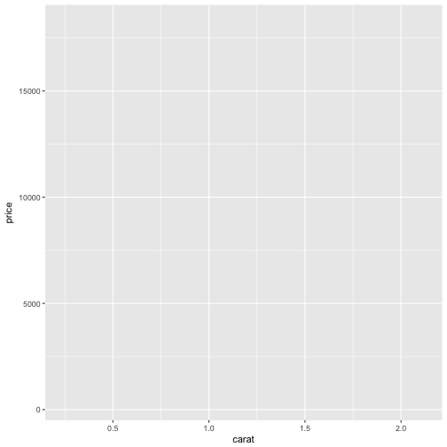
Notice that the ggplot object is plotted, but there is no geometry applied to the object so we don’t see any of the data.
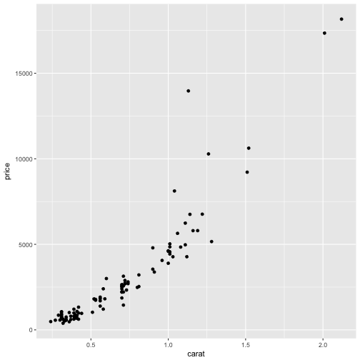
Here we will add one of the most common geometries, geom_point to the object to get a scatterplot.
p + geom_point()
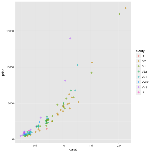
#Here we apply color as an aesthetic.
p + geom_point(aes(color = clarity))

#We can also add the aesthetic to the orignal ggplot object. It is best practice to keep the aesthetics in the same layer as much as possible. This will allow your plotting code to be clearer and more readable.
ggplot(data = diamonds_sample, mapping = aes(x = carat, y = price, color = clarity))+
  geom_point()
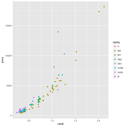
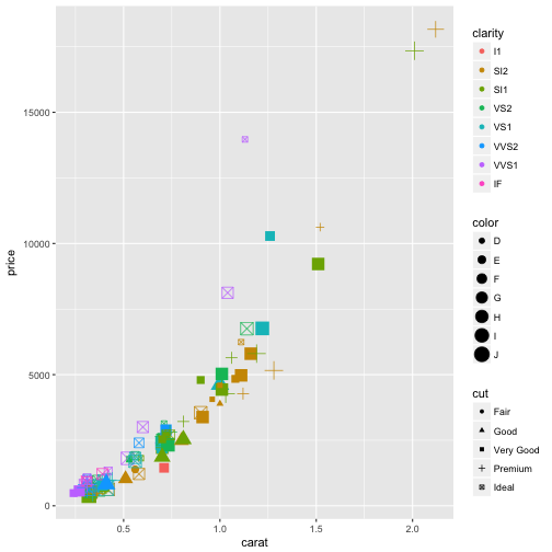
As noted above, there are a variety of different aesthetics we can apply to our plotting object. Be careful as the more aesthetics you add, the more complex your plot becomes and this is not necessarily a good thing.
#plot diamonds_sample using multiple aesthetics
ggplot(diamonds_sample, aes(carat, price, color = clarity, shape = cut, size = color))+
  geom_point()
Attributes
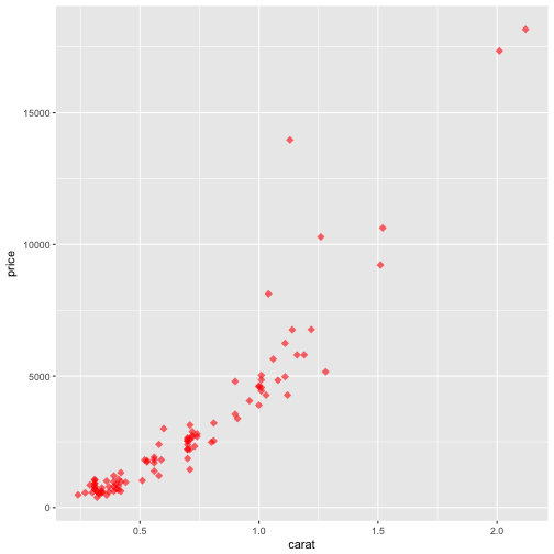
The aesthetic layers can be applied as attributes. It is important to know the difference between the two. Where aesthetics are mapped to specific data points on the plot based on the variables, attributes are applied to the entire plot object.
p <- ggplot(diamonds_sample, aes(carat, price, color = clarity))

p + geom_point(alpha = 0.6, shape = 18, size = 3)
Attributes override aesthetic layers as shown in the example below.
#the color attribute over rides the color = clarity aesthetic
p + geom_point(alpha = 0.6, shape = 18, size = 3, color = "red")
Overplotting
Often is this case that you will have to deal with overplotting:
- Large datasets
- Imprecise data and so points are not clearly separated on your plot
- Interval data (i.e. data appears at fixed values)
- Aligned data values on a single axis.
As we saw earlier, we can adjust the size, shape, and alpha layers to account for this:
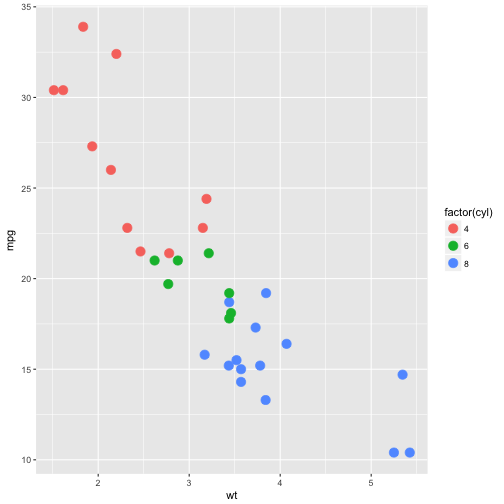
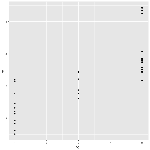
p <- ggplot(mtcars, aes(wt, mpg, color = factor(cyl)))

#notice we have some overlapping points. We can do better.
p + geom_point(size = 4)
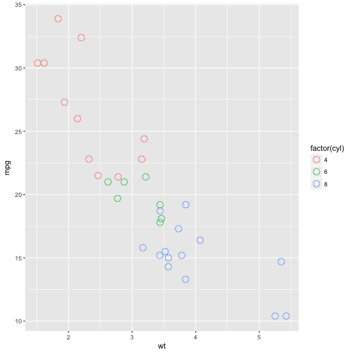
#adjust the shape
p + geom_point(size = 4, shape = 1)
Another solution to overplotting is the geom_jitter function.
p <- ggplot(mtcars, aes(x = cyl, y = wt))

p + geom_point()
# with geom_jitter
p + geom_jitter()
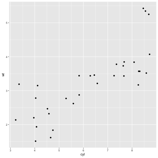
As shown above, geom_jitter fixed the overplotting, but it overcorrected. We can fix this using a variation on the function, calling the width argument.
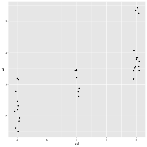
#set the width within the geom_jitter function
p + geom_jitter(width = 0.1)

And finally, we can pass the position_jitter() function to the position = argument within geom_point()
p + geom_point(position = position_jitter(0.1))
Geometries
In the previous examples, we already saw one of the most common types of geometries used for plotting- points used for scatterplots - which use the geom_point() or geom_jitter() functions or arguments.
Bars are another common geometry when it comes to data visualization.
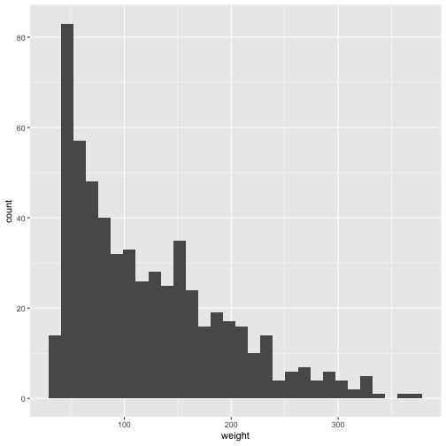
Histograms are useful plots for visualizing distributions of a dataset and ggplot2 comes prepared with the geom_histgoram function.
The default argument is stat = 'bin', separates the continuous variable into bins so you get a sense of the general distribution of the data. The amount of bins defaults to binwidth = range/30.
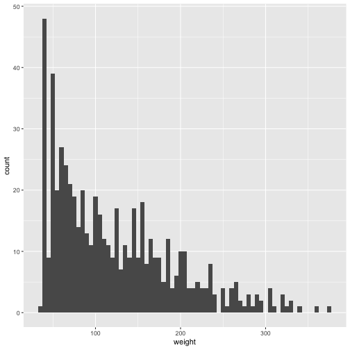
#plot histogram of the weight variable from the ChickWeight dataset
p <- ggplot(ChickWeight, aes(weight))

p + geom_histogram()
#adjust the binwidth
p + geom_histogram(binwidth = 5)
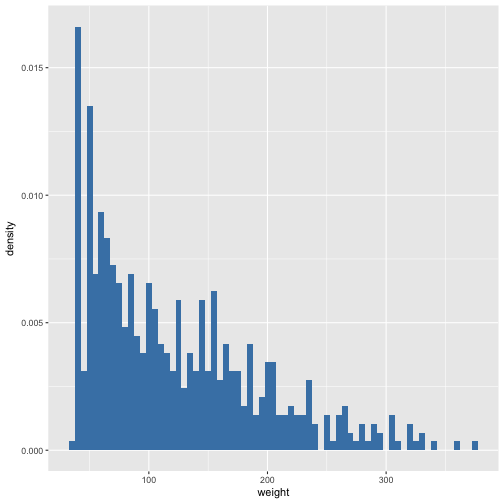
We can also customize the y-axis. By default, the y-axis displays the count of the dataset, but we can change it to display the density. Displaying the density is useful for showing the proprotional frequency of a bin relative to the whole dataset.
p + geom_histogram(aes(y = ..density..), binwidth = 5, fill = "steelblue")
It could be the case that you want to split your distributions by some factor. To avoid overlap, geom_histogram stacks bars at each bin to display the distribution.
#plot the chick weight distribution by diet
p <- ggplot(ChickWeight, aes(x = weight, fill = Diet))

p + geom_histogram(binwidth = 5)
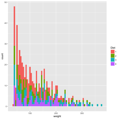
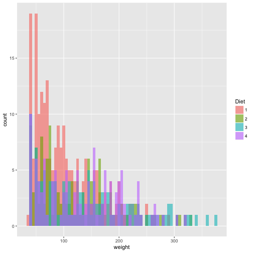
As you can see, this can be a little difficult to discern. The y-axis count values are a sum of the distribution at that particular bin which can be misleading. To correct this, we can set position = "identity", which unstacks the bins.
p + geom_histogram(binwidth = 5, position = "identity", alpha = 0.6)
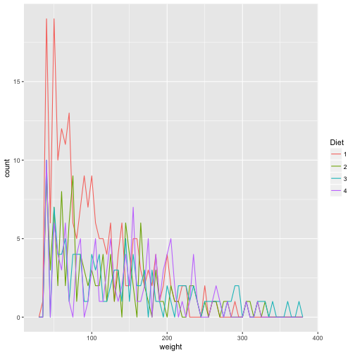
An even better solution is to use geom_freqpoly.
#remember to change fill to color
ggplot(ChickWeight, aes(weight, color = Diet))+
  geom_freqpoly(binwidth = 5)
Another use of bars is the geom_bar used for bar plots. It has a position argument that can take on three arguments:
- stack (the default position)
- fill
- dodge
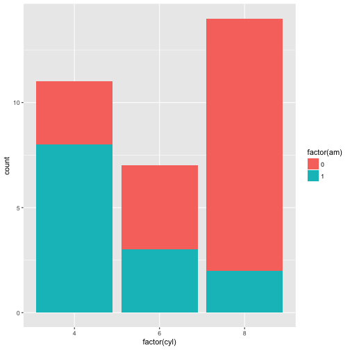
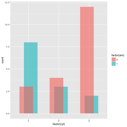
#create barplot with the mtcars dataset
p <- ggplot(mtcars, aes(x = factor(cyl), fill = factor(am)))

#bar plot with default position = "stack"
p+geom_bar()
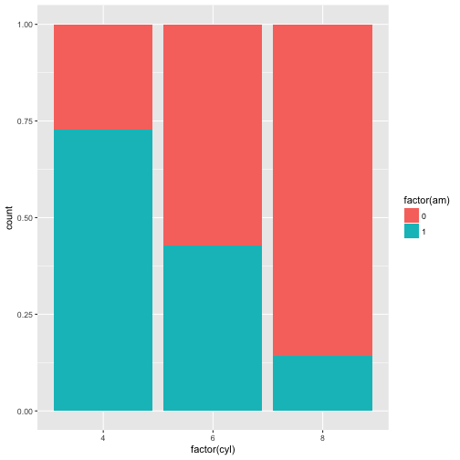
#position fill
p + geom_bar(position = "fill")
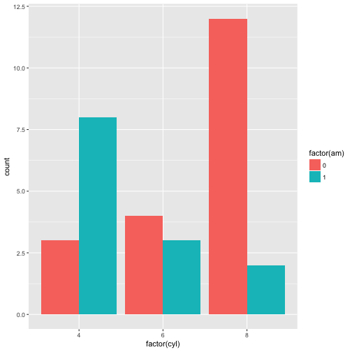
#position dodge
p + geom_bar(position = 'dodge')
#overlapping bars
p + geom_bar(position = position_dodge(width = 0.3), alpha = 0.6)
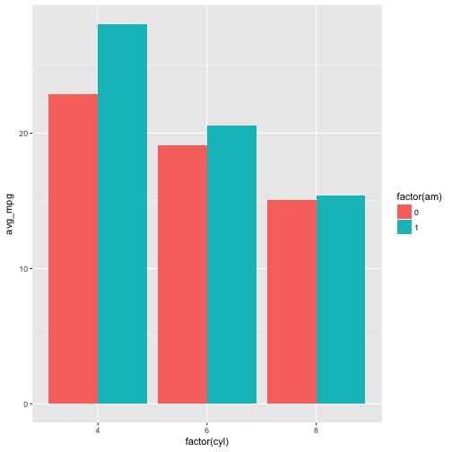
It is possible to use both x and y as aesthetics with geom_bar() by using the stat = 'identity argument.
Notice the error in the first example.
#create new variable avg_mpg which calculates the average mpg by cyl and am. assign to ggplot object.
p <- mtcars %>%
  group_by(cyl, am) %>%
  summarise(avg_mpg = mean(mpg)) %>%
ggplot(aes(x = factor(cyl),y = avg_mpg, fill = factor(am)))

#error message due to y aesthetic
p + geom_bar()
## Error: stat_count() must not be used with a y aesthetic.
#use stat = 'identity' to create bar plot of the avg_mpg for each cyl, by am.
p + geom_bar(stat = 'identity', position = "dodge")
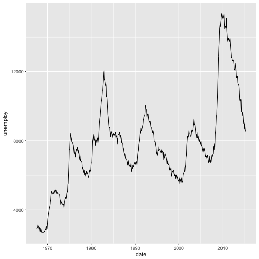
Finally, we’ll have a look at line plots using the geom_line function.
Line plots are useful for time-series analysis. We’ll take a look at some examples using the economics dataset included in the ggplot2 package.
#have a look at the economics dataset
str(economics)
## Classes 'tbl_df', 'tbl' and 'data.frame':	574 obs. of  6 variables:
##  $ date    : Date, format: "1967-07-01" "1967-08-01" ...
##  $ pce     : num  507 510 516 513 518 ...
##  $ pop     : int  198712 198911 199113 199311 199498 199657 199808 199920 200056 200208 ...
##  $ psavert : num  12.5 12.5 11.7 12.5 12.5 12.1 11.7 12.2 11.6 12.2 ...
##  $ uempmed : num  4.5 4.7 4.6 4.9 4.7 4.8 5.1 4.5 4.1 4.6 ...
##  $ unemploy: int  2944 2945 2958 3143 3066 3018 2878 3001 2877 2709 ...
p <- ggplot(economics, aes(x = date, y = unemploy))

p + geom_line()
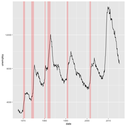
#create df recess of recession dates
recess <- data.frame(begin = as.Date(c('1969-12-01', '1973-11-01', '1980-01-01', '1981-07-01', '1990-07-01', '2001-03-01')),
                     end = as.Date(c('1970-11-01', '1975-03-01', '1980-07-01', '1982-11-01', '1991-03-01', '2001-11-01')))


#plot the periods of recession.
#Note the inherit.aes = FALSE argument
ggplot(economics, aes(x = date, y = unemploy)) +
  geom_line() +
  geom_rect(data = recess, aes(xmin = begin, xmax = end, ymin = -Inf, ymax = Inf), fill = "red", alpha = 0.2, inherit.aes = FALSE)
And just like other geometries, geom_line can take on various aesthetics/attributes. Let’s explore these with the txhousing dataset from the ggplot2 package.
geom_path can also be used in substitute of geom_line
#view the dataset
str(txhousing)
## Classes 'tbl_df', 'tbl' and 'data.frame':	8602 obs. of  9 variables:
##  $ city     : chr  "Abilene" "Abilene" "Abilene" "Abilene" ...
##  $ year     : int  2000 2000 2000 2000 2000 2000 2000 2000 2000 2000 ...
##  $ month    : int  1 2 3 4 5 6 7 8 9 10 ...
##  $ sales    : num  72 98 130 98 141 156 152 131 104 101 ...
##  $ volume   : num  5380000 6505000 9285000 9730000 10590000 ...
##  $ median   : num  71400 58700 58100 68600 67300 66900 73500 75000 64500 59300 ...
##  $ listings : num  701 746 784 785 794 780 742 765 771 764 ...
##  $ inventory: num  6.3 6.6 6.8 6.9 6.8 6.6 6.2 6.4 6.5 6.6 ...
##  $ date     : num  2000 2000 2000 2000 2000 ...
#manipulate the dataset
txhousing$city <-factor(txhousing$city)

#how many cities in the dataset?
levels(txhousing$city)
##  [1] "Abilene"               "Amarillo"
##  [3] "Arlington"             "Austin"
##  [5] "Bay Area"              "Beaumont"
##  [7] "Brazoria County"       "Brownsville"
##  [9] "Bryan-College Station" "Collin County"
## [11] "Corpus Christi"        "Dallas"
## [13] "Denton County"         "El Paso"
## [15] "Fort Bend"             "Fort Worth"
## [17] "Galveston"             "Garland"
## [19] "Harlingen"             "Houston"
## [21] "Irving"                "Kerrville"
## [23] "Killeen-Fort Hood"     "Laredo"
## [25] "Longview-Marshall"     "Lubbock"
## [27] "Lufkin"                "McAllen"
## [29] "Midland"               "Montgomery County"
## [31] "Nacogdoches"           "NE Tarrant County"
## [33] "Odessa"                "Paris"
## [35] "Port Arthur"           "San Angelo"
## [37] "San Antonio"           "San Marcos"
## [39] "Sherman-Denison"       "South Padre Island"
## [41] "Temple-Belton"         "Texarkana"
## [43] "Tyler"                 "Victoria"
## [45] "Waco"                  "Wichita Falls"
#subset the data for only a few cities
txh <- txhousing %>% filter(city %in% c("Austin", "El Paso", "Houston", "San Antonio", "Dallas", "Corpus Christi", "Texarkana", "Odessa", "Fort Worth", "Waco"))
#create summary statistics using txh dataset
txh_summary <- txh %>%
group_by(year, city) %>%
summarise(avg_sales_per_year = mean(sales))
#create plot object using txh_summary dataset
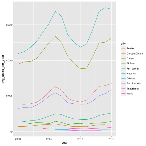
p <- ggplot(txh_summary, aes(x = year, y = avg_sales_per_year, color = city))
#line plot
p + geom_line()
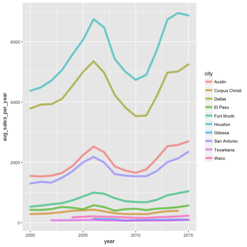
#adjust the attributes of the line plot
p + geom_line(lineend = "round", alpha = 0.6, size = 2)
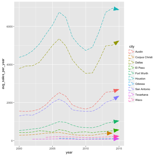
#more attributes!
p + geom_line(linetype = 5, arrow = arrow(angle = 20, ends = "last", type = "closed"))
```